Visualizing Data
Thorntale can pull and chart data directly from your database, or from a public or shared Google Sheet. For now, let’s create a chart using a Google Sheet.
Connecting to a Google Sheet
Create a plain page. We’ll add a Chart to this page using the /chart command.
Choose the Google Sheets option. Give this source a name and paste the URL of
the Google Sheet you’d like to query. You can use your own data, or the sample
sheet below.
https://docs.google.com/spreadsheets/d/18bfGYl6axr4gS6ic6TAKxeGfGL5D_xgrXwLRKZhuGIY/edit#gid=0If you use your own data, be sure to give view access to the Google Sheet with access@thorntale.iam.gserviceaccount.com.
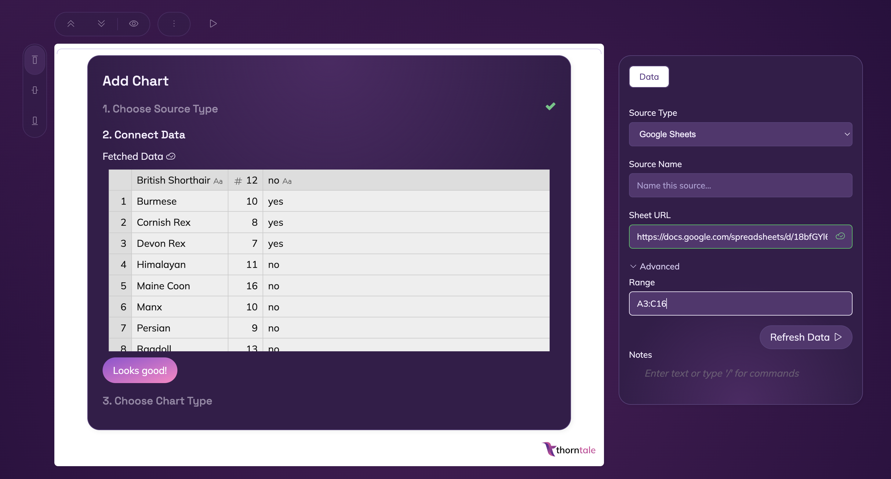
You can use the Advanced tab in the Source Panel to select a certain range to query, like A3:C16, if you don’t need all the data in the sheet.
Building a Bar Chart
Once the data loads, click the Looks Good! button.
The sample data has three columns:
- Cat Breed
- Average Weight
- Hypoallergenic?
Since these are categories, instead of a timeseries or similar, we’ll choose a Bar Chart to represent this data.
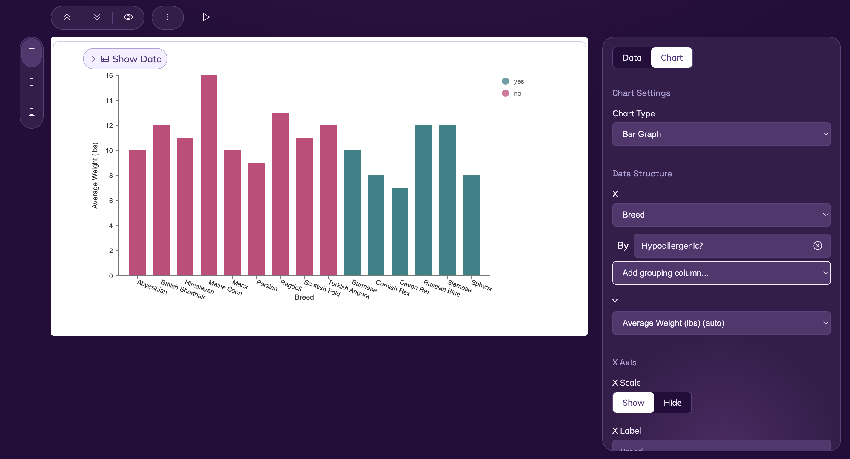 Set the x-axis to
 Breed and the y-axis to Average Weight. You can also group by whether or not a given breed is Hypoallergenic.
Feel free to play around with the axis labels, series labels, and other settings.
I’m ready to show the world.
Great! Let’s present our findings.